
How Materializecss Framework divide the content ?? Example based on Mobile and Tablet Form.
26 May, 2016
RESPONSIVE GRID SYSTEM: The Responsive Grid System isn't a framework. It's not a boilerplate either. It's a quick, easy, flexible way to create a responsive web site. A webpage of any screen either phone, tablet or Desktop have not more than 12 parts so we have to learn how can we manage our content in these 12 parts.
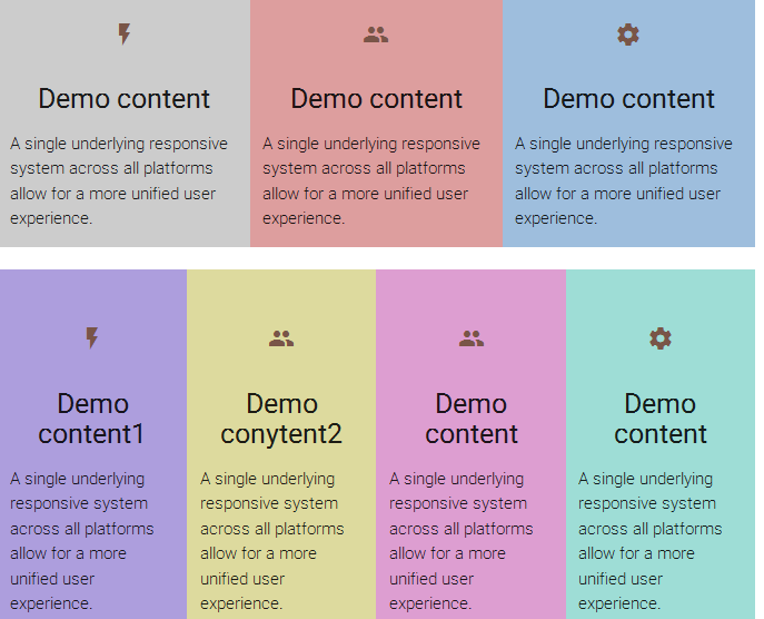
Materializecss framework also provides a 12 column fluid responsive grid like bootstrap . It uses the row and column style classes to define rows and columns respectively. Most of the code used as like "col s12 m12 l12 " . col for no of columns in a row and s12 for small screen like phones, we used s and no. of division of column and m12 for tablet it means medium size and l means large which used for desktop and 12 means no of column divisions.
You can also break up the column as per your requirements:
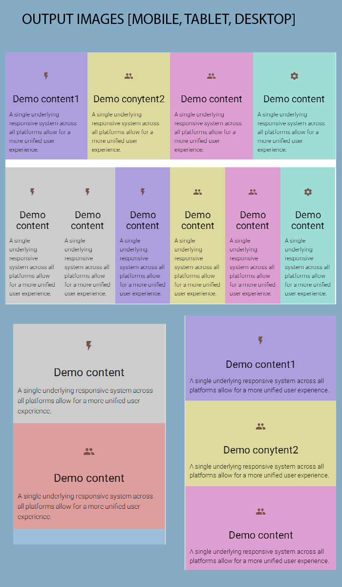
Here i have provided one example just copy the code sava as grid.html and run on any browser and can also see in tablet and mobile view.
NOTE: for firefox press ctrl+shift+M (to view in standard size.)
NOTE: for firefox press ctrl+shift+M (to view in standard size.)
Output: