
Materializecss Framework supports many Shadow effects
28 June, 2016
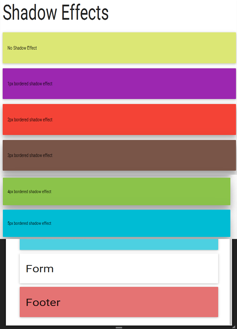
Shadow effect gives you new kind of design in your HTML Page. It starts from z-depth0 to z-depth-5.
1. z-depth-0 remove the shadow of elements having z-depth by default.
2 z-depth-1: In this effect You can see 1px bordered shadow
3. z-depth-2: In this effect You can see 2px bordered shadow
4. z-depth-3: In this effect You can see 3px bordered shadow
5. z-depth-4: In this effect You can see 4px bordered shadow
6. z-depth-5: In this effect You can see 5px bordered shadow
Here we have provided all kinds of example in a simple containers or divs.
Different shadows have different impact on divs.
It starts from z-depth-0 to z-depth-5. just apply on the divs.
" z-depth-1 means 1px solid bordered shadow.
z-depth-2 means 2px solid bordered shadow.
z-depth-3 means 3px solid bordered shadow.
z-depth-4 means 4px solid bordered shadow.
z-depth-5 means 5px solid bordered shadow.
and in last if z-depth-0 means No shadow. "
<!DOCTYPE html>
<html>
<head>
<title>Materializecss Framework</title>
<meta name="viewport" content="width=device-width, initial-scale=1.0, maximum-scale=1.0, user-scalable=0">
<link rel="stylesheet" href="https://fonts.googleapis.com/icon?family=Material+Icons">
<link rel="stylesheet" href="https://cdnjs.cloudflare.com/ajax/libs/materialize/0.97.3/css/materialize.min.css">
<script type="text/javascript" src="https://code.jquery.com/jquery-2.1.1.min.js"></script>
<script src="https://cdnjs.cloudflare.com/ajax/libs/materialize/0.97.3/js/materialize.min.js"></script>
</head>
<body>
<div class="container"><!--start with container-->
<div class="row"><!--start with row-->
<h1>Shadow Effects</h1>
<div class="card-panel lime lighten-2">
<p>No Shadow Effect</p>
</div>
<!--No shadow effect because of no z-depth.-->
<div class="card-panel purple z-depth-1">
<p>1px bordered shadow effect</p>
</div>
<div class="card-panel red z-depth-2">
<p>2px bordered shadow effect</p>
</div>
<div class="card-panel brown z-depth-3">
<p>3px bordered shadow effect</p>
</div>
<div class="card-panel light-green z-depth-4">
<p>4px bordered shadow effect</p>
</div>
<div class="card-panel cyan z-depth-5">
<p>5px bordered shadow effect</p>
</div>
</div><!--close row-->
</div><!--close container-->
</body>
Output: