Find out many diffrent styles with Border-radius CSS.
26 June, 2016
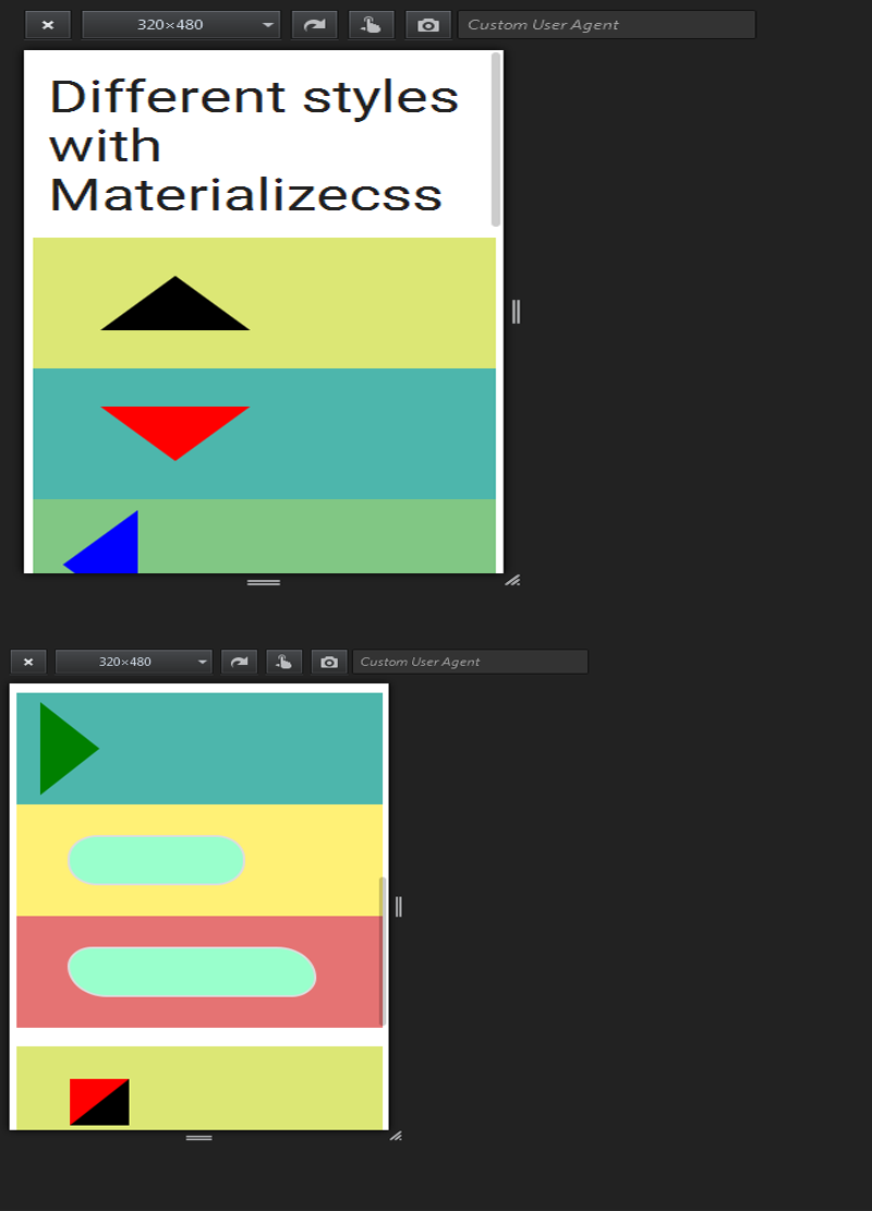
I m trying to explain here how can we design with the help of Border-radius . We are into the materializecss Framework so its responsive and it helps you how can we make our pages responsive.
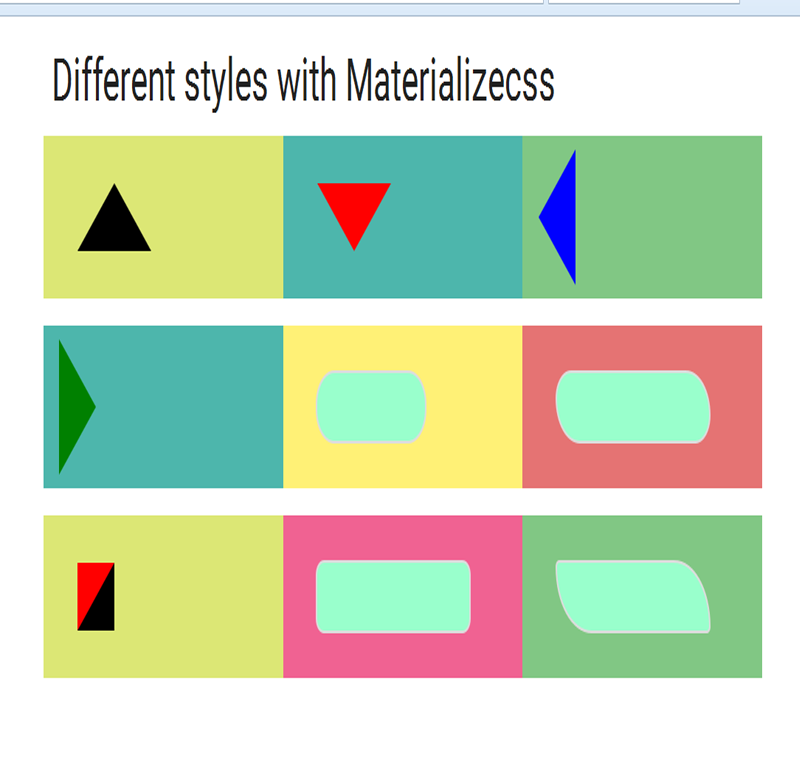
Box1: In Box1, There is a triangle and its fully CSS work. We have just transparent right and left border and 50px border of bottom and there is the output.
Box2: In Box2, There is a triangle but its in reverse shape and its fully CSS work. We have just transparent right and left border and 50px border from top and there is the output.
Box3: In Box3, We have just transparent top and bottom border and 50px border of right and there is the output.
Box4: In Box4, We have just transparent top and bottom border and 50px border of left and there is the output.
Box5: In Box5, Just give border-radius: 25px; and You will find out your round-corners.
Box6: In Box6, Just give border-radius: 25px 40px; and You will find out your round-corners. Here first value applies to top-left and bottom-right corner,
and the second value applies to top-right and bottom-left corner
Box7: In Box7, Change border style . You will find out code here below.
Box8: In Box8, Just give border-radius: 11px 11px; and You will find out your round-corners.
Box9: In Box9, Just give border-radius: 5px 50px; and You will find out your round-corners.
After reading , Now we have to look up the code. Just copy from here and save as a differentstyle.html and run the code in any browser.
You have to learn one thing how we initialize the container and row and column work that is important.
Start Code from here:
<!DOCTYPE html>
<html>
<head>
<title>Materializecss Framework</title>
<meta name="viewport" content="width=device-width, initial-scale=1.0, maximum-scale=1.0, user-scalable=0">
<link rel="stylesheet" href="https://fonts.googleapis.com/icon?family=Material+Icons">
<link rel="stylesheet" href="https://cdnjs.cloudflare.com/ajax/libs/materialize/0.97.3/css/materialize.min.css">
<script type="text/javascript" src="https://code.jquery.com/jquery-2.1.1.min.js"></script>
<script src="https://cdnjs.cloudflare.com/ajax/libs/materialize/0.97.3/js/materialize.min.js"></script>
<style>
.arrow-up {
width: 0;
height: 0;
border-left: 50px solid transparent;
border-right: 50px solid transparent;
border-bottom: 50px solid black;
margin: 35px;
}
.arrow-down {
width: 0;
height: 0;
border-left: 50px solid transparent;
border-right: 50px solid transparent;
border-top: 50px solid #f00;
margin: 35px;
}
.arrow-right {
width: 0;
height: 0;
border-top: 50px solid transparent;
margin: 10px;
border-left: 50px solid green;
border-bottom: 50px solid transparent;
}
.arrow-left {
width: 0;
height: 0;
border-top: 50px solid transparent;
border-bottom: 50px solid transparent;
border-right:50px solid blue;
margin: 10px;
}
.round_corner {
border: 2px solid #ddd;
padding: 25px 40px;
background: #9FC;
width: 150px;
margin: 33px;
border-radius: 25px;
}
.round_corner2 {
border: 2px solid #ddd;
padding: 25px 40px;
background: #9FC;
width: 210px;
margin: 33px;
border-radius: 25px 40px;
}
.arrow-box {
width: 0;
height: 0;
border-left: 0px solid transparent;
border-right: 50px solid black;
border-top: 50px solid #f00;
margin: 35px;
}
.round_corner3 {
border: 2px solid #ddd;
padding: 25px 40px;
background: #9FC;
width: 210px;
margin: 33px;
border-radius: 11px 11px;
}
.round_corner4 {
border: 2px solid #ddd;
padding: 25px 40px;
background: #9FC;
width: 210px;
margin: 33px;
border-radius: 5px 50px;
}
width: 0;
height: 0;
border-top: 50px solid transparent;
margin: 10px;
border-left: 50px solid green;
border-bottom: 50px solid transparent;
}
.arrow-left {
width: 0;
height: 0;
border-top: 50px solid transparent;
border-bottom: 50px solid transparent;
border-right:50px solid blue;
margin: 10px;
}
.round_corner {
border: 2px solid #ddd;
padding: 25px 40px;
background: #9FC;
width: 150px;
margin: 33px;
border-radius: 25px;
}
.round_corner2 {
border: 2px solid #ddd;
padding: 25px 40px;
background: #9FC;
width: 210px;
margin: 33px;
border-radius: 25px 40px;
}
.arrow-box {
width: 0;
height: 0;
border-left: 0px solid transparent;
border-right: 50px solid black;
border-top: 50px solid #f00;
margin: 35px;
}
.round_corner3 {
border: 2px solid #ddd;
padding: 25px 40px;
background: #9FC;
width: 210px;
margin: 33px;
border-radius: 11px 11px;
}
.round_corner4 {
border: 2px solid #ddd;
padding: 25px 40px;
background: #9FC;
width: 210px;
margin: 33px;
border-radius: 5px 50px;
}
</style>
</head>
<body>
<div class="container"><!--start with container-->
<!--start with row-->
<h3>Different styles with Materializecss</h3>
<div class="row">
<div class="col s12 m4 l4 lime lighten-2">
<div class="arrow-up"></div>
</div>
<div class="col s12 m4 l4 teal lighten-2">
<div class="arrow-down"></div>
</div>
<div class="col s12 m4 l4 green lighten-2">
<div class="arrow-left"></div>
</div>
</div>
<div class="row">
<div class="col s12 m4 l4 teal lighten-2">
<div class="arrow-right"></div>
</div>
<div class="col s12 m4 l4 yellow lighten-2">
<div class="round_corner"></div>
</div>
<div class="col s12 m4 l4 red lighten-2">
<div class="round_corner2"></div>
</div>
</div>
Output:


